Despite the best of intentions, small inevitable design mistakes creep into even the most beautifully appointed homes. To safeguard your home against these design mistakes, brush up on the most common design slips and the steps you can take to prevent them from entering your home. Read on to find out the most frequent decorating blunders.
The Wrong Size Rug
A correctly sized rug can add grandeur and sophistication to a room. An incorrectly sized rug can make the room’s scale feel out of proportion and cheapen the entire scheme, regardless of how much youve invested in the space. When measuring for a rug, at least the front legs”if not all”should be anchored by the rug. When in doubt, you should always size up. If you find a rug youre in love with but is too small for the space, you can also layer it on top of a larger neutral rug, such as a sisal or jute rug.
Accent walls
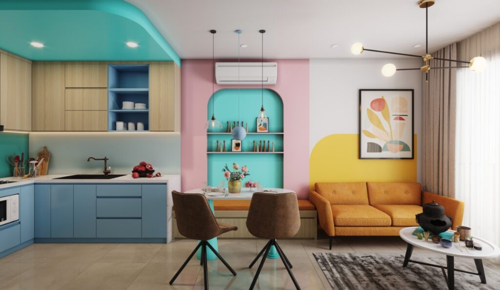
Accent walls”whether its paint or wallpaper”can transport your home back to a 1990s showhome. Avoid an accent wall and show confidence in your design decisions by committing to adorning all four walls with the same color or pattern.
Generic Lighting
Especially if youve purchased a new construction home, updating the generic lighting can significantly improve your home. Consider lighting the jewelry of your home and select fixtures that will instantly elevate and add elegance to the space. A carefully curated lighting plan should include a show-stopping chandelier, various sconces, art lights, floor lamps, table lamps, pendants and flush mount lighting. Layering the lighting creates a collected and thoughtful space.
Mass-Produced Art
Regardless of price point, commercial art lacks the bespoke touch that art can bring to a space. Custom art elevates a space and is often the finishing touch a room needs to feel unique. Custom pieces offer depth and individuality that art from retailers often lacks. You never want to walk into someone elses living room and discover they have the same framed piece of art hanging over their sofa as you.
Art Hung at the Wrong Height
Even if you have custom art, the whole room will feel off if it’s hung at the wrong height. A general rule of thumb is the middle of the art should be 57 to 60 inches off the ground, depending on your height. Art above the sofa should cover two-thirds of the sofas width and should be approximately six to eight inches above the back of the sofa.
Too Low Curtain Rods
Hanging a curtain rod right above the window is a common mistake that can make the entire room appear smaller and cramped. However, extending the curtain rod eight to 12 inches on either side of the window and eight to 12 inches above the window frame turn standard windows into stunning focal points. When in doubt, hang your curtain rod high and wide.
As you design your home, resist the design blunders that can make your luxury home feel a little less luxurious. Instead, a few design tweaks can create a luxe and elegant dream home.
Published with permission from RISMedia.


